Press ad.
When we created the press ad at the beginning of this project it had to be based on the measurements given for creative review. To give us an idea of how much this would cost if we were to do it for real, Sadie got in touch with creative review and they sent a break down of costs that she then shared with all of us. As a company starting out it would seem creative review is one of the most likely ways to really get yourself out there and make yourself known to the correct audience. Above I have looked at some of the latest designer ads in the most recent version of creative review. Some of them I was really impressed with and others not so much but I think this is just based on personal preference and what I feel would work best for our own company. I feel the minimalistic approach works best because its straight to the point and clear to read, the busier ads seem to get lost amoungst all the others on the page. The great thing about creating a press ad is that this can easily be turned into something else such as a flyer which works for our company as we will need to create one of these as another form of reaching our student target audience. Its clear a lot of companies go for very dark colours, is this something we should be aware of in terms of creating sophisticated design?
Websites.
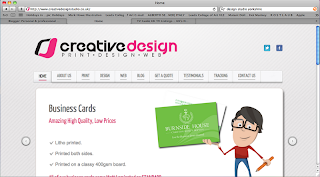
Our second form of self promotion is probably one of the most obvious ways as its in keeping with modern day and how the world tends to work nowadays. One main way a client may look for a design agency is via the internet so it's really important that we create a website to showcase ourselves and what we can do. One thing all the websites above I have looked at have in common is the fact each has used a limited colour pallet. I think this works really successfully because having a touch of colour makes it more visually interesting but its not overpowering so theres nothing to distract from the information that is being presented about the companies and their work. Using neutral colours or black seems to add an element of sophistication. Having a simplistic central design to each website means your eye is constantly drawn to the correct elements on screen and the use of link 'buttons' means the websites are easy to navigate around. I feel with websites that less is more, so as long as we include the most important bits of information that are likely to sell us as a company we'll have a well created website that will cause no confusion and give the correct impression.
Two other forms of self promotion we could use are newspaper advertising and flyers. This is because we technically have three different target audiences. Students/designers, consumers and clients are the catergories. We need students and designers to stock the shop with designer work to sell, consumers to buy this work that is stocked in the shop so that we make an income from this and clients that form the main sector of our business that we design various things for. To reach the clients, the press ad and website will be the main form of promotion initially because we can reach a large number of people all at once. To reach students and designers both the press ad and flyers would come in useful as design students tend to read magazines such as creative review and the flyers could be distributed to education institutions around the city. Finally to reach the consumer we could advertise in a local newspaper as this again would reach a large amount of the population and people tend to cut things out and pass them on to friends. We could also have a launch party to make people aware.


No comments:
Post a Comment