1. What skills have you developed through this module and how effectively do you think you have applied them?
I have become a lot more experimental with the final pieces I create in terms of the range, instead of just sticking to things such as posters i've worked more with 3D elements throughout this project. To capitalise on this in future I will try and incorporate something new that I haven't tried previously into each project and even if this doesn't work then at least I have experimented with it and learnt a new process. I feel that my final pieces show that my illustrator skills have become stronger because the responses I have created are quite neat and i've also learnt a few new illustrator skills. To capitalise on software skills in general i'm going to try and learn some of the shortcuts I currently do not use, this will make the design process somewhat quicker and will generally be a handy skill to have. Finally, I feel as though confidence shows through my work because a lot of my design previously tended to be on white backgrounds and not very experimental in terms of colour but this time my work seems quite different to the design I was producing last year. This shows confidence in terms of the fact i've been willing to take more a risk and work a little out of my comfort zone.
| |||||||||||||||||||||||||||||||||||||||||||||||||||||||||||||||||||||||||||||||||||||||||||||||||||||
Monday, 21 November 2011
Good is... evaluation.
Good is... printed final pieces.


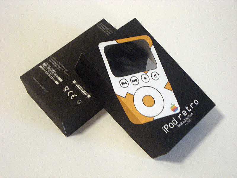


Overall I am very pleased with the way my final pieces have come out once printed. However after going through the print process I have become more aware that the packaging and bag would probably work better on card rather than cartridge paper because they would be a lot more durable and maybe even come across as being higher quality. When considering my stock I thought more about keeping the same throughout all pieces when this doesn't necessarily have to be the case because the colours used keep them together. This is something I could always re-visit in my own time to see if my thoughts are correct. I faced an issue when printing in the mac suite with the laser printers where the area in which the Apple logo was placed would come out a slightly different black to the actual background, this however seems to have resolved itself when printing in the digital dungeon as these printers are of higher quality. Seeing a collective shot of all my products together shows me that the evolution poster still works well as part of the series because the other products still contain a fair amount of white on them and the font chosen links them together too. The packaging and the bag compliment each other well when printed in the same colour as though the consumer would have bought the orange iPod. One of the main factors that ties them together is the cut out of the screen area even though both are slightly different with one being just an empty space. The fact the cut out of the screen for the bag is so large isn't an issue at all because the packaging fits below this so won't fall out. Seeing the posters side by side also works really well and in particular this is because two of them have the logo and text etc in the same place and the middle one is slightly higher so it means there is some kind of pattern. Although this is a good feature it's not of huge importance when they would be put 'out there' because they would never been seen together.
Good is... final presentation boards.


These are the final presentation boards I created in order for someone to be able to understand the 'story' behind my final products. I created boards of what I think is most important in terms of understanding my story and as this is the first time i've ever made presentation boards I don't think I have done too badly because people should be able to understand where some of my ideas came from in order to get my final pieces and also the context that these things would appear in. Keeping my presentation boards quite minimalist too has come from the idea that my final pieces are quite minimalist because I'd like everything to work together as a whole project.


These are images of my printed presentation boards. For future reference I am likely to print these boards A2 because in this case I have printed two A3 sheets but due to the border created when you print a single sheet they don't quite meet up properly in the middle.
Sunday, 20 November 2011
Good is... revised final pieces.
All final pieces have been created using Pantone colours from the Pantone solid colour book.
When it came to the final crit I made a few of the changes I had time for that were given to me within the feedback. These changes were, changing the background to black, making the iPods have an actual screen image and including some sort of reason as to why my product is being launched. I would still apply the same special finishes and use the same stock as I proposed with my original final pieces (cartridge paper) apart from one slight change to the bag design because I altered the back of it.
When it came to the final crit I made a few of the changes I had time for that were given to me within the feedback. These changes were, changing the background to black, making the iPods have an actual screen image and including some sort of reason as to why my product is being launched. I would still apply the same special finishes and use the same stock as I proposed with my original final pieces (cartridge paper) apart from one slight change to the bag design because I altered the back of it.


The posters would be printed on cartridge paper and have a matt varnish applied to them so that they seem a bit more high quality yet not too much as they won't really be interacted with in the sense that you touch them. I have added actual screens to the iPods using a screen layout for the iPod that I found on google images, to make this a bit less uniform I have changed the hue/saturation of each of the screens to match that of the iPod colour. I feel they look a lot more real with this screen added because the consumer will be able to imagine more what it would look like in real life and how you can interact with it. It also shows that the iPod is actually a full colour version like they are currently. I've also added a tag line to my poster of "celebrating 10 years of the iPod" since creating the particular design above because I needed more reasoning as to why I was launching this iPod and they have actually been around for ten years so the launch of a new one can mark this occasion. The black background works really well with the iPod imagery because it looks a little more sophisticated and the colours stand off from this really clearly.

The change made to this particular product was using the back of the bag to place the back of the iPod on. This solved the issue I was having of where best to place the text in a way that suited the rest of the layout. The logo and text work really well on the back of the iPod because this information is typically found on the back of an actual iPod anyway and it means it doesn't look as though i'm trying to fit too much information on to the front of the bag. The back of the bag where the iPod back design is would be foil blocked and this is because the back of an actual iPod is shiny metal so it will make it more obvious why I decided to place this information here. Using foil blocking will also give the bag a high quality, sophisticated looking finish that something described as 'limited edition' should have. The front of the iPod on the bag would still be spot varnished as I proposed previously to make this area seem almost real too and the bag would be die cut once the design was printed.

The black background has also benefited the barcodes and other symbols I placed on the back of my packaging because they now blend in instead of being these block sections. The background has also benefited the actual iPod design because as with the posters the colours on the iPod imagery become quite bold and vibrant. The imagery on the front of the packaging would still be spot varnished as I proposed previously and the text would be foil blocked to continue with this idea of high quality, limited edition packaging. Also as proposed previously the packaging would be die cut once printed, scoring along edges that need to be folded and cutting the shape out of the stock and then hand made up.

The only product I didn't change as such in terms of the colour scheme was the iPod evolution poster. My reason for keeping this the same was because when I applied a black background it seemed as though there was far too much black on the page and it was quite over-whelming. The information also became not necessarily as easy to interpret because the design didn't seem as easy to look at it, it was too harsh on the eye and it's really important that it captures the attention of the audience. I had however, originally stated that I want to keep this design as simplistic as possible and using a minimalistic approach is the best way to do this. I would still apply a spot varnish to the apple and the paths in order for them to stand out and capture the audiences attention with the glint they are likely to have.
The print production manual; my final booklet design.
This is my final issuu booklet that I created with my idea of the 'top ten things to know about print'. To sum up my final booklet I think that the content is well executed in terms of what I have included because some of the points are quite important when it comes to design for print. The layout however could definitely be improved because on some levels it may be a bit too uniform and could do with being a bit more experimental to make the content seem that much more exciting and appealing. I'm happy with what I have produced but well aware that there are improvements that could be made if I were to continue with this. I feel this has been really quite helpful to me throughout this module in terms of research in particular because everything I have learnt through research for this booklet has tied in with my own products for the 'good is...' brief and really helped me understand how processes work. The execution of layout is another important factor because this impacts upon how your information is interpreted when it's seen by a consumer for the first time, although my layout is quite uniform I feel the fact that I have included pictures is a positive factor because it may help other designers understand the information they are reading more. All in all this booklet is a short summary of some of the things I have learnt throughout this module and will definitely be something I can look back on.
Wednesday, 16 November 2011
PPD group tutorial.
Throughout this tutorial we discussed topics such as ways of making yourself heard when trying to get in contact with a client, what clients look for in terms of a CV when your applying for a job and also what we need to do to help our own professional development. I've always had so many under answered questions when it comes to applying for placement and generally any experience within the creative industry and so far this PPD module seems to be answering pretty much all of those questions. I always feel very inspired after talks about 'the future' and the creative industry but again, as with enterprise, I don't have a great deal of confidence sometimes so i'm not entirely sure how to approach industrial placement. As we don't really have much of a portfolio yet we were given an action plan and wrote things that could be seen as a starting point.
My personal action plan included, creating a business card. This is a great way to network with people because you can just hand it to them and everything they need to know in terms of getting in touch with you is there. Being graphic designers our business cards can also be 'outside the box' and quite visually exciting if we put our mind to it. This business card is likely to change over time but something simple would be a great starting point. Start looking at creative CV's, design agencies tend to look for a creative CV rather than the uniform academic CV. This is because they are generally interested in the creative side of you as a person and you can make it again, quite visually exciting and engaging. The final thing on my action plan is to look at studios so that I can find the ones that interest me most. If I find a collection of studios then I can begin to create some form of contact list and be able to get in touch with people about work placement etc or even just a day visit. Its best to find studios that interest me because i'm likely to get a lot more out of the experience.
My personal action plan included, creating a business card. This is a great way to network with people because you can just hand it to them and everything they need to know in terms of getting in touch with you is there. Being graphic designers our business cards can also be 'outside the box' and quite visually exciting if we put our mind to it. This business card is likely to change over time but something simple would be a great starting point. Start looking at creative CV's, design agencies tend to look for a creative CV rather than the uniform academic CV. This is because they are generally interested in the creative side of you as a person and you can make it again, quite visually exciting and engaging. The final thing on my action plan is to look at studios so that I can find the ones that interest me most. If I find a collection of studios then I can begin to create some form of contact list and be able to get in touch with people about work placement etc or even just a day visit. Its best to find studios that interest me because i'm likely to get a lot more out of the experience.
Enterprise group tutorial.
Through out this tutorial we discussed topics such as what we have learnt so far in the lectures, what we do to promote ourselves (if anything) and our expenses sheet we were given to fill out. We also began discussing the fact we will have to choose small groups of approximately four people to work with the set up our own business, this means we can start thinking about what sort of things we would like to do and also who we would like to work with.
We were each given an action plan so that we could write down things for us to go away and consider until enterprise begins again after the christmas break. On my personal action plan I wrote down, create a behance account to get my work out there. This is something I have never really considered doing before due to lack of confidence but I feel it will be beneficial because I need to begin to make an attempt at getting myself recognised and not just hiding away. The other thing that was on my action plan is, get a business plan from the bank. This business plan is something you usually get when setting up a business account with a particular bank because we need to be aware of how this works when setting up our own businesses in small groups.
I think the task of setting up a group business is going to be quite interesting because there is a general view that being freelance is quite simple where as i'm learning more and more as I go through my time on the course that this is not the case.
Good is... final crit.


This was the feedback I got from the final crit of the 'good is...' brief. I've found the comments that have been made are really valid and can help me tie up any loose ends my project may have. Some of the things mentioned may not be possible as it being such a late stage in the project but a lot of other things I can try before sticking with a final idea, such as the making the background black on my elements of design. Certain comments made are things that I have thought about and are soon to be proposed although it has been very useful to see that my potential target audience are thinking the same thing. I've also included the post it notes that were attached to my work with general comments about certain aspects, again very useful. Overall this crit has really helped me clarify my ideas and the main reason I think this was is that it was a completely new set of people looking at my work and finding things out about my project for the first time. For this reason I think I was able to learn wether or not my work communicated quite the way I wanted it to.
Good is... proposed final pieces.
All final pieces have been created using Pantone colours from the Pantone solid colour book.
All my final pieces would be printed on cartridge paper because this is low cost and creates a good background to work with in order for the special finishes I would use to look their best. Initially I thought that because my campaign is a one off all my products would be best off being printed digitally but then I considered the fact that elements such as my advertising posters would be placed all over the world to really get my message out there and although the product is limited edition because its a world wide target audience the limit will actually not be that little due to the population of the world. I therefor think that lithography would be better because I can have quite a large number of each of the products printed and it will more than likely be cheaper to do so using this technique. The print job should also be quite low cost due to the few colours I have used in my designs and the areas this colour is applied to.
All my final pieces would be printed on cartridge paper because this is low cost and creates a good background to work with in order for the special finishes I would use to look their best. Initially I thought that because my campaign is a one off all my products would be best off being printed digitally but then I considered the fact that elements such as my advertising posters would be placed all over the world to really get my message out there and although the product is limited edition because its a world wide target audience the limit will actually not be that little due to the population of the world. I therefor think that lithography would be better because I can have quite a large number of each of the products printed and it will more than likely be cheaper to do so using this technique. The print job should also be quite low cost due to the few colours I have used in my designs and the areas this colour is applied to.

Paper bag printed on A1.
When the consumer purchases the iPod they would be given this bag to carry their product in. I decided to propose this layout as my final layout for my bag because I felt this was most successful out of all those that i'd designed so far and for me to move forward with this product I really need feedback before definitely choosing this design. The bag and packaging design will both be given very faint grey lines just before they are sent to print so I am still aware of where I need to cut and score but they aren't so visible that they ruin the design. Both the front and back iPod would be spot varnished so they stand off the cartridge paper and give a desirable high quality finish. The text on the bag would be foil blocked silver to again give a high quality finish and make the bag something that the consumer would consider keeping. This is one element of all of my products that may make the cost of the print job a bit more expensive because depending on which colour iPod the consumer has bought, the same colour will be applied to the bag, therefor there will be different colour batches needed to be printed resulting in different printing plates for each job. Once the bags are printed the correct die cut shape would be made for it and they would be die cut and scored within the screen for the handle and around the edge for a perfect finish ready to be made up by hand.

Evolution poster printed on A2.
This would come free with the purchase of every iPod in order to inform the consumer about how far the iPod has actually come. It would also be blown up to billboard size and be displayed on the stand at the Appleexpo because the fact the iPod is being launched to celebrate 10 years of iPod is significant. I thought A2 was an appropriate size for the evolution poster because all the information can be seen but is not too over whelming and is more likely to fit nicely within wall space if the consumer chose to display it. I chose to keep a bit of a white border around the edge of my design because this fits in with the layout of the other products I have created therefor keeping them as part of a series. The Apple and the different colour paths would be spot varnished in order to emphasise the fact the path has been the most important part of the evolution because if it wasn't for this there wouldn't have been generations of each iPod. The text to the bottom of the poster would be foil blocked for a high quality looking finish. These two small processes may add much value to the poster and make it seem like the consumer really has something worth keeping. This may be a slightly more costly product with the colour range being wider but colours are well worth the quality and the scale will effect the cost because if this is printed on sheets the likely hood is that you'll only be able to fit two to a sheet.

Packaging on A3.
When the consumer purchases the iPod this is the packaging it would come in. The final packaging design with added barcodes and information on the back has really come to life. I took the barcodes and symbols from the back of my own iPod packaging I had as an example of what it would look like if it was really made. I also copied the information from the back of my iPod packaging but to suit the particular characteristics of the iPod I have designed. I think the fact the packaging is so minimalist is one of the most effective things about it because consumers don't tend to appreciate being bombarded with information so it gives them enough but not too much and again links in with the rest of the product campaign. The screen of the iPod will be made from acetate so the product can be seen within the box, in a way teasing the consumer. The ipod image itself would be spot varnished to make it seem almost real, to make it stand off the page and also to give the packaging a high quality finish. The elements of information on the back would be left plain because the text is too small for a special finish and just needs to be legible. The text on the front of the packaging however would be foil blocked to link in with the other products I have already proposed. All these elements added together would give the packaging the 'limited edition' feel it should have so it again seems like something worth keeping. To end the design it would be die cut within the screen and around the edge from the printed page and then made up by hand. The great thing about this net is that because its so small you can fit quite a lot to a page therefor saving money.


Bus stop advertisement - 1200mm x 1800mm.
This series of posters would be posted up in bus stops all over the world in order to make people aware of the product that is to come. Using bus stop advertising is probably quite significant because people who commute will see this and more often than not they carry some kind of mp3 player with them for their journey so i'd be attracting the correct audience. These were the three posters that I felt worked best together as a series because they are of the same nature in terms of layout so link together but they still look different. Due to these products being so big they would be printed from a roll rather than a sheet so to fit to the desired measurements. This is the one product in which I do not intend to use foil blocking on the text, this is because advertisements are generally up until the date of something has passed and then they are disposed of, so using such a high quality finish would be an expensive waste. I also think that using spot varnish would be a bit of a waste because this is definitely a finish that is meant to be interacted with and can not be enjoyed through a plastic sheet. This product would however have a matt varnish applied to it because I feel this will not look as cheap as just sticking with the cartridge paper and may bring the colours out in the design a bit more. This overall is going to be my cheapest product in terms of print finishes yet has to have the most impact in order for the campaign to work. I think the simplicity of the designs work really well because all the information that is relevant is there and if consumers want to find out more then they are able to by going on the website included. The fact the design is being printed on cartridge paper will benefit it in terms of colour because the colours tend to look quite bold on this particular stock. I could have considered printing this particular part of my campaign on glossy paper but again i'm not sure that this could fulfil its potential when placed behind a piece of plastic in a bus stop.
Subscribe to:
Comments (Atom)