Monday, 15 April 2013

Design Strategy; internship.


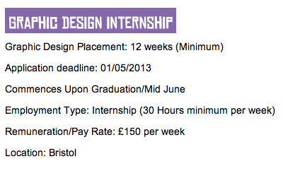
My friends told me about this internship with Propaganda which is a worldwide indie night club. I looked into it and although it's absolutely perfect for me and I have all the skills they require, the location puts a massive downer on it. I worked out that even if I lived in a hostel during the week I still wouldn't be able to afford it based on this wage, one of the downsides to internships of course. Commuting would also be completely out of the question because it's 4 hours one way from where I'll be living as well as the money being an issue again. Although the location of this means that I won't go for it, it has restored my faith a little because I was really struggling to find things I thought I may enjoy. I'm really gutted about this because I think it would be an amazing opportunity but at least it's given me a little insight into the world of internships and the sometimes downsides to them as well as the practicality and importance of location. 

Design Strategy; work placement at Room For Design.

During the easter break I did a three day work placement at Room For Design in Northallerton in order for me to gain experience within the industry and see the day to day runnings of a Graphic Design studio. When I emailed Joe about the work placement I sent him a few examples of my work and off the back of that they said they had the perfect brief for me to have a go at due to my design interests. This brief involved designing sheep themed wedding stationery and I got stuck into it straight away. I was especially pleased because I seem to be drawing animals a lot at the moment so I knew I'd enjoy it. There's a few examples above of some development for the stationery and you can also see the sheep vectors I designed on illustrator. Whilst I was on my placement I also got to work on some ammendments that clients had sent through for other briefs. This was really good because I got to see the sort of work Room For Design have been doing and there was a range of different outcomes. Whilst doing this I learnt how they record the ammendments you make too and this was useful because it's something I'm unfamiliar with. Overall, whilst on my placement I definitely got a lot out of it because I'd never been in a proper working studio environment before, I got to ask questions about design and the industry in general and the people were really nice! Before doing this placement I was quite nervous about the thought of going into a job because I had no idea what to expect but now I feel so much more relaxed about it and you could even say quite excited! I know every studio will be different and I'm never going to love them all but the atmosphere at Room For Design was really inviting and I felt comfortable straight away. I think this is down to the fact that it's a small working environment and this is something I've always preferred. If I get the opportunity to go back to Room For Design I definitely will. After being so nervous I was dissapointed with how fast my placement went, I didn't want to leave! Success. 

Monday, 8 April 2013

Design Strategy; Leeds based studios.


I've been researching more studios/designers but this time in Leeds. The reason I keep choosing different locations within the North is because this is ideally where I would like to be so by seeing who is out there, I know where to look for potential jobs. I've become quite fond of Leeds now and with living here I'm aware that it's quite a good city for design. I didn't want to just look at the studios that we've been linked to via uni because I know everyone will be looking at them so I've found some different ones that I feel link to my practice and interests within Graphic Design. I particularly love the work of Unit because they work with a range of different disciplines and one of these happens to be illustration. It's not often you find a studio that categorises this seperately so this says to me that they are quite active in this area. They've worked with some really big clients too so it may be a studio worth visiting for further insight. I've also included a freelancer within this post because I feel it's relevent to the research I'm doing. Although being freelance has never been something I've considered doing, I have found quite a few designers within Leeds recently so this gives me confidence in the fact it's a back up option for me. Obviously it's easier said than done though. 


Monday, 25 February 2013

Design Strategy; contacting Room For Design.


During the summer I had a studio visit to Room For Design back home in Northallerton. At the end of the visit there was a mention of a possible work placement so I've kept that in mind all this time up until I've finally found the right time to follow this up. I contacted Joe explaining that I'd been to see them before and wondered if it was possible for me to come in and work with them. I attached a small PDF of a few examples of my work too because when I went to visit I didn't actually take anything with me so I thought it would be nice for them to see this. Joe got back to me and we arranged a few days during the easter break for me to go in so I'm really pleased and can't wait for my placement now. They have also moved studios but within the same building so it'll be really nice to see where they are working from now! 

Design Presence; portfolio surgery two.

I had my second portfolio surgery with Joe Gilmore and it was great to recieve a second round of feedback on my work because obviously everyone interprets things differently so some of the points he made weren't brought up the first time round but were really relevent to improve it. 
Joe suggested that I utilise a double page spread layout so that each board appears landscape because it seemed as though I was holding back a little bit as some of my images were quite small and I left quite large boarders around each of my boards. He also said that when someone is viewing it, it will make it a lot easier to see each induvidual projects because at the moment I have a single A3 boards per project and he said when you're looking the top project with the portfolio landscape, you have to lean over so you don't necessarily take it all in properly and it's a bit difficult to view. 
I asked Joe about his opinion in including branding on each seperate page. He said personally he's not a fan of this but in some ways it works because my logo is quite simple and at least whoever is viewing my portfolio will remember my name. 
I need to have a space between 'The brief' and 'Target audience' to make this easier to read because at the moment it's quite squashed up. After thinking about this though I've decided I might take the target audience out altogether because although it's relevent it's not massively significant as the focus will be on the actual images. 
Joe suggested that I create a grid for my double page spreads so that every single board is kept uniform because he said a lot of people will wonder why things aren't uniform and it says a lot about you as a designer. You can be quite playful with this grid but it's just there to guide. 
With one of my briefs Joe suggested having the film titles under each typeface because someone may spend more time trying to work this out than taking in the actual work. 
Joe said it'd be great to see the typeface and actual character designs from the wind in the willows brief because although you can see it in the photographs, it's not completely clear and this aspect was a substaintial part of the brief. 
Going back to layout, I need to make sure all the spaces between images are the same on all the spreads. 
With the black and white print brief, it's better not to have one square photo and all the rest rectangle because this doesn't particularly fit in. 

These changes make a lot of sense now that someone has gone through and pointed them out to me so I'm going to take all the advice on board and re-jig my portfolio. 

Wednesday, 20 February 2013

Design Presence; portfolio.

Just before the portfolio surgeries I decided to take some of the projects out based on conversations I'd had with some of my peers. Some of the projects weren't my favourite and they suggested taking these out because I probably wouldn't be able to talk about them very comfortably unlike the ones below that I have left in. There was also the Coca-Cola brief, this project wasn't print based at all and that isn't who I am as a designer so this one definitely needed to go. I've also decided to shrink each project down to just one page. Before I felt like I was taking two for the sake of it and there was maybe a little too much white space. This format gives a hint of the projects but there is still much to be seen and advice is usually that you don't want to give everything away. I feel the text also sits a lot neater on a layout like this too. It's a small portfolio at the moment but I'd rather have that and love the work thats in there. 


This is my portfolio after the surgery with Ben and the changes he suggested. The main alteration I've made is to the typeface project. The products seemed to fall at the last hurdle a bit with this brief and it was more about the typefaces for me so I decided to just use these and explain the purpose they were designed for. This works a lot better because they appear a lot stronger just placed by themselves and I think I'll also feel a lot more confident talking about them.

Tuesday, 19 February 2013

Design Presence; portfolio surgery one.

I had my first portfolio surgery with Ben Haworth and found the feedback I was given was very constructive and useful in a way which helps me understand how well my current portfolio communicates to people viewing it for the first time and whether there is anything that I need to reconsider. I noted down some of the key points that were discussed. 

- Really push the illustration/image work, show that I am capable of a range of styles so I can be flexible in a studio environment. 
- The pattern work is successful, how can I utilise this throughout future projects? 
- With The Wind in the Willows brief, reword the brief, it appears more traditional visually rather than reinvented. This style doesn't come across as well as some of my other hand rendered work so consider this with future projects. 
- The illustrative type brief board needs to include the logo design for the company I created. This brief could have taken a more comical approach in order to avoid copyright with the quotes and make it more appealing. The outcomes look a bit clinical but this could easily be improved. The comical aspect would suit the brand more. 
- The black and white brief has brand essence and it's important to understand a brand is not just a logo. This could be the link branding has to my personal practice more so than actual logo design. 
- With illustrative type I could just include the typeface design to showcase this skill as this part of the brief was a strength. 
- Processes should be an after thought as the ideas and concept are most important and what potential employers are interested in.